
Proton Tech Lab

Web Design

Web Design

Designing Mobile Navigation That Actually Works

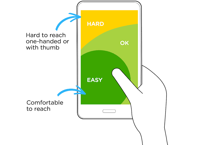
Designing Mobile Navigation That Actually Works Most website visitors use phones. Yet mobile navigation often frustrates—tiny targets, hidden menus, awkward interactions. Desktop navigation shrunk to fit screens doesn’t work. Mobile-first navigation designed for thumbs and small screens does. At Proton Tech Lab, we design navigation mobile users actually enjoy. Let’s explore how to create menus that work for the majority of your visitors. Design for Thumbs According to Nielsen Norman Group, most users hold phones one-handed, navigating with thumbs. The bottom portion of screens is easiest to reach. Top corners require hand repositioning. Place primary navigation within comfortable thumb reach—typically the lower half of screens. Make Tap Targets Large Minimum tap targets should be 44×44 pixels—preferably larger. Small links frustrate users and cause mis-taps. Space targets apart so tapping one doesn’t accidentally hit another. Generosity with touch targets improves accuracy and reduces frustration. Simplify Menu Structure Deep menu hierarchies work poorly on mobile. Reduce levels. Combine related items. Eliminate rarely-used options. Every additional tap to reach destinations loses visitors. Flat navigation structures serve mobile users better than complex hierarchies. Consider Bottom Navigation Bottom navigation bars place core actions within natural thumb reach. Apps popularized this pattern; websites increasingly adopt it. For sites with few primary sections, bottom navigation can work better than hamburger menus hidden in corners. Make Hamburger Menus Work If using hamburger menus, make them discoverable. Add text labels alongside icons. Ensure menus open smoothly and close easily. Make the menu itself touch-friendly with large options and clear hierarchy. Hidden navigation should be worth finding. Show Current Location Mobile users get lost easily. Indicate current page clearly within navigation. Use visual highlighting, breadcrumbs, or section headers. Orientation reduces confusion and helps users understand where they are and where they can go. Enable Easy Return Users must always be able to get home or back. Persistent home links, visible back buttons, and clear logo-as-home patterns provide escape routes. Never trap users in sections with no clear way out. Test on Actual Devices Emulators miss real-world problems. Test on actual phones of various sizes. Watch real users navigate. Hold the device yourself and try reaching all targets. Physical testing reveals issues simulations hide. Prioritize Core Actions Mobile screens have limited space. Not everything deserves primary visibility. Identify the most important actions and make them prominent. Secondary options can live in menus. Prioritization improves focus and reduces decision fatigue. Navigate Mobile-First Effective mobile navigation respects how people actually use phones. Large targets, thumb-friendly placement, simplified structures, and clear orientation make navigation usable rather than frustrating. Design for the majority—your mobile visitors. Need better mobile navigation? At Proton Tech Lab, we design for real mobile users. Contact us today to discuss your website. Let’s make navigation work!

Web Design

Designing Loading States That Keep Users Engaged

Designing Loading States That Keep Users Engaged Loading is inevitable. Networks have latency. Servers process requests. Content takes time to appear. But perceived waiting time matters more than actual waiting time—smart loading states make waits feel shorter and less frustrating. At Proton Tech Lab, we design loading experiences that keep users engaged. Let’s explore how to turn necessary waits into positive moments. Show Progress, Not Spinners According to Nielsen Norman Group, progress indicators feel faster than spinners even when taking identical time. Progress bars show movement toward completion. Percentage counters give concrete feedback. Users tolerate waits better when they see advancement. If you can’t measure actual progress, animate pseudo-progress that slows near completion—still faster-feeling than endless spinning. Use Skeleton Screens Skeleton screens show content structure before content loads—gray boxes where images will appear, lines where text will render. Users perceive the page as loading rather than blank. The interface feels faster because something is happening visually. Match skeleton shapes to actual content layout. Mismatched skeletons create jarring transitions when real content appears. Load Content Progressively Don’t wait for everything to load before showing anything. Display text while images load. Render above-the-fold content first. Progressive loading gives users something to engage with immediately while remaining content appears. Add Meaningful Animation Loading animations should entertain or inform, not just spin. Brand-relevant animations reinforce identity. Helpful messages explain what’s happening. Even simple animations distract from perceived wait time when thoughtfully designed. Avoid animations that feel slow themselves—smooth, quick movements feel faster than heavy, sluggish ones. Communicate What’s Happening “Loading” says nothing. “Fetching your results” or “Processing payment” tells users what’s occurring. Specific messages reduce uncertainty and anxiety. Users wait more patiently when they understand why. Handle Errors Gracefully Loading states must handle failures. When content won’t load, show clear error messages with retry options. Don’t leave users staring at eternal loading indicators. Time out appropriately and communicate what happened. Consider Optimistic UI Optimistic UI assumes actions will succeed, showing results before server confirmation. Likes appear instantly, messages show as sent immediately. When actions rarely fail, optimistic updates feel instant while processing happens behind the scenes. Avoid Loading When Possible The best loading state is no loading state. Prefetch likely content. Cache aggressively. Optimize assets to load faster. Every loading indicator avoided is user frustration prevented. Design for speed first; design loading states for what remains. Test Perceived Performance Measure both actual and perceived performance. Users may rate faster-feeling experiences higher than objectively faster ones with poor loading design. Test different loading approaches and measure satisfaction, not just milliseconds. Make Waiting Work Loading states transform necessary waits from frustrations into acceptable moments. Progress indicators, skeleton screens, meaningful animations, and clear communication help users tolerate what they can’t avoid. Design loading as carefully as any other interface element. Need better loading experiences? At Proton Tech Lab, we design interfaces that keep users engaged. Contact us today to discuss your website. Let’s make waiting work!

Web Design

Essential Security Headers Every Website Should Have

Essential Security Headers Every Website Should Have Your website might be vulnerable in ways you’ve never considered. Security headers are instructions your server sends to browsers, telling them how to handle your content securely. Most sites lack them entirely—leaving visitors exposed to attacks that proper headers prevent. At Proton Tech Lab, we implement comprehensive security. Let’s explore the essential headers every website should configure. Content-Security-Policy According to OWASP, Content-Security-Policy (CSP) is your strongest defense against cross-site scripting attacks. CSP tells browsers which sources can load scripts, styles, images, and other resources. Anything from unauthorized sources gets blocked. Start with a restrictive policy and loosen as needed. A strict CSP might break functionality initially, but the protection is worth the configuration effort. Strict-Transport-Security HTTP Strict Transport Security (HSTS) forces browsers to use HTTPS exclusively. Even if someone types “http://” or clicks an old HTTP link, the browser automatically upgrades to HTTPS. This prevents downgrade attacks that intercept unencrypted connections. Once implemented, browsers remember HSTS for the specified duration—protecting return visitors automatically. X-Content-Type-Options Browsers sometimes guess content types incorrectly—a vulnerability attackers exploit. X-Content-Type-Options with “nosniff” prevents browsers from MIME-sniffing, forcing them to trust declared content types. This simple header blocks a category of attacks with minimal effort. X-Frame-Options Clickjacking attacks embed your site in invisible frames, tricking users into clicking things they can’t see. X-Frame-Options controls whether browsers allow your site in frames. Set it to DENY or SAMEORIGIN to prevent your site from being embedded maliciously. Referrer-Policy When visitors click links on your site, browsers tell destination sites where visitors came from. This can leak private URLs or sensitive parameters. Referrer-Policy controls what information gets shared—protecting your visitors’ privacy. Common settings include “no-referrer” for maximum privacy or “strict-origin-when-cross-origin” for a reasonable balance. Permissions-Policy Modern browsers offer powerful features: camera access, location, microphone, payment APIs. Permissions-Policy (formerly Feature-Policy) lets you disable features your site doesn’t need—reducing attack surface and preventing malicious scripts from accessing sensitive capabilities. X-XSS-Protection While mostly superseded by CSP, X-XSS-Protection provides backup protection for older browsers. It enables built-in browser filtering against reflected cross-site scripting attacks. Easy to implement and doesn’t hurt—add it alongside CSP. Testing Your Headers Free tools like Security Headers or Mozilla Observatory scan your site and grade your security header implementation. Run these scans to identify missing headers and configuration problems. Aim for an A grade—anything less indicates gaps. Implementation Approaches Headers can be set at multiple levels: web server configuration, application code, or CDN settings. Where you implement depends on your stack. Most hosting platforms and CDNs offer easy header configuration. For custom setups, server config files handle the job. Protect Your Visitors Security headers are invisible protection—visitors never see them, but they prevent real attacks. Implementation takes minimal effort compared to the protection gained. Every website should configure these essential headers. Your visitors deserve the protection. Need help securing your website? At Proton Tech Lab, we implement comprehensive security measures. Contact us today to discuss your security. Let’s protect your visitors!

Web Design

How to Audit Your Website for Accessibility Issues

How to Audit Your Website for Accessibility Issues Millions of people navigate the web with disabilities—visual, auditory, motor, cognitive. Barriers on your website exclude these users entirely. An accessibility audit identifies problems so you can fix them, making your site usable for everyone. At Proton Tech Lab, we build accessible websites. Let’s explore how to audit your site and uncover accessibility barriers. Understand the Standards According to W3C, the Web Content Accessibility Guidelines (WCAG) provide the standard for web accessibility. WCAG organizes requirements into four principles: perceivable, operable, understandable, and robust. Most audits target WCAG 2.1 Level AA compliance. Start with Automated Testing Automated tools catch obvious issues quickly. Browser extensions like WAVE, axe, or Lighthouse scan pages for common problems: missing alt text, low contrast, missing form labels, heading structure issues. Run these tools across key pages. But automated tools catch only about 30% of issues. They’re a starting point, not a complete audit. Manual testing must follow. Test Keyboard Navigation Put your mouse away and navigate using only the keyboard. Tab through your entire site. Can you reach every interactive element? Is focus visible? Can you operate menus, forms, and buttons without a mouse? Keyboard access is essential for many users. Watch for keyboard traps—places where focus gets stuck with no way to continue navigating. These completely block keyboard users. Check Color and Contrast Text must contrast sufficiently against backgrounds. WCAG requires 4.5:1 ratio for normal text, 3:1 for large text. Use contrast checker tools to verify. Also ensure information isn’t conveyed by color alone—error messages shouldn’t rely only on red text. Review Images and Media Every meaningful image needs alt text describing its content or purpose. Decorative images need empty alt attributes. Videos need captions and ideally transcripts. Audio content needs text alternatives. Media accessibility opens content to everyone. Examine Forms Forms cause frequent accessibility problems. Every input needs a visible label properly associated in code. Error messages must be clear and connected to their fields. Required fields should be indicated. Form completion shouldn’t rely on timing. Test with Screen Readers Screen readers convert visual content to audio. Testing with one reveals how blind users experience your site. Does content make sense when read aloud? Are interactive elements announced correctly? NVDA (free) or VoiceOver (built into Mac/iOS) let you test. Check Heading Structure Headings create document structure that assistive technology users navigate by. Heading levels should be hierarchical (H1, then H2s, then H3s) without skipping levels. Screen reader users often scan headings to find content—structure matters. Document Your Findings Record every issue found: what it is, where it occurs, which WCAG criterion it violates, and how to fix it. Prioritize fixes by impact and effort. Some issues block users entirely; others merely inconvenience. Fix blocking issues first. Make Your Site Work for Everyone Accessibility audits reveal barriers you didn’t know existed. Fixing them expands your audience, improves legal compliance, and creates better experiences for all users. Start auditing, start fixing, and keep improving. Need help with accessibility? At Proton Tech Lab, we audit and remediate websites for full accessibility. Contact us today to discuss your website. Let’s make it work for everyone!

Web Design

Turning 404 Error Pages into Positive User Experiences

Turning 404 Error Pages into Positive User Experiences Every website has broken links and missing pages. It’s inevitable. What isn’t inevitable is losing visitors when they hit these dead ends. A thoughtful 404 page transforms frustration into opportunity—keeping users on your site and guiding them toward what they need. At Proton Tech Lab, we design error pages that help rather than frustrate. Let’s explore how to turn your 404 page into a positive user experience. Why 404 Pages Matter According to Google, users who encounter unhelpful error pages often leave immediately. But users who find helpful 404 pages frequently continue browsing. The difference between bounce and retention often comes down to how you handle errors. Default server error pages are cold, confusing, and offer no path forward. Custom 404 pages show you care about user experience even when things go wrong. Acknowledge the Problem Clearly Tell users what happened in plain language. “Page not found” is clearer than “Error 404.” Explain that the page they wanted doesn’t exist, might have moved, or the URL might be wrong. No jargon, no confusion. A touch of personality helps too. A friendly tone or gentle humor softens the frustration without being annoying. Match your brand voice—playful brands can be playful; professional brands should stay professional. Provide Clear Navigation Options Don’t strand users on dead ends. Offer clear paths forward: a prominent link to your homepage, links to popular pages or categories, and your main navigation menu. Give users multiple ways to continue their journey. Think about where users likely wanted to go and suggest those destinations specifically. If your site has distinct sections, link directly to section hubs. Include Search Functionality A search box on your 404 page lets users find what they were looking for without guessing at navigation. If they know what they wanted, search gets them there directly. Pre-populate the search box with keywords from the failed URL when possible. Maintain Brand Consistency Your 404 page should look like your website—same header, footer, colors, and design language. Users should know they’re still on your site, not lost somewhere else entirely. Brand consistency maintains trust even during errors. Add Value When Possible Some brands use 404 pages as opportunities. Feature popular content, recent blog posts, or special offers. If users can’t find what they wanted, maybe they’ll discover something else valuable. Just don’t overwhelm—help should be the primary focus. Let Users Report Issues Include a way for users to report broken links. A simple “Report this problem” link helps you identify and fix issues. Users appreciate feeling heard, and you get valuable feedback about site problems. Track 404 Errors Monitor which URLs trigger 404 errors. High-traffic broken links deserve fixes—either restore the content or redirect to relevant alternatives. Analytics reveal patterns that help you prevent future errors. Test Your Error Pages Visit a non-existent URL on your site and experience what users experience. Is it helpful? Does navigation work? Does it load quickly? Many sites neglect error pages because developers rarely see them during normal testing. Turn Errors into Opportunities Errors happen. How you handle them reveals how much you value users. A thoughtful 404 page keeps visitors engaged, maintains brand impression, and transforms dead ends into new paths. Invest a little attention in your error pages—your users will thank you. Need help with your website experience? At Proton Tech Lab, we design every page—including error pages—for optimal user experience. Contact us today to discuss your website. Let’s turn every page into a good experience!

Web Design

Simple User Testing Methods to Improve Your Website

Simple User Testing Methods to Improve Your Website You know your website too well to see its problems. What seems obvious to you confuses visitors. What you think is intuitive makes others struggle. User testing reveals these blind spots by watching real people use your site—and it’s simpler than you think. At Proton Tech Lab, we use user testing to create websites that actually work for visitors. Let’s explore simple methods you can use to identify and fix usability problems. Why User Testing Matters According to Nielsen Norman Group, testing with just five users reveals approximately 85% of usability problems. You don’t need massive research budgets or sophisticated labs. A few real users provide insights that transform website effectiveness. Analytics show what users do; testing shows why. Bounce rates reveal pages with problems but not what those problems are. Watching users struggle identifies specific fixes. The Five-Second Test Show someone your homepage for five seconds, then hide it. Ask: What does this company do? What can you do on this site? What do you remember? Their answers reveal whether your key messages communicate instantly. If users can’t identify your purpose in five seconds, first impressions are failing. This quick test requires no special tools—just a timer and willing participants. Task-Based Testing Give users specific tasks: “Find the pricing information.” “Contact customer support.” “Add a product to your cart.” Watch them attempt each task without helping. Note where they struggle, hesitate, or fail. Choose tasks that matter for your business goals. If users can’t complete important actions, you’re losing conversions. Task success rate directly measures usability. Think-Aloud Protocol Ask users to verbalize their thoughts while navigating your site. “I’m looking for… I think this might be… I’m confused because…” This narration reveals mental models and expectations you’d otherwise miss. Resist the urge to help or explain. When users struggle, that’s data. Your job is to listen and observe, not defend your design choices. Hallway Testing Grab anyone available—colleagues, friends, family—for quick informal tests. Show them your site and ask them to find something or complete a task. Even untrained testers reveal obvious problems. Hallway testing works because fresh eyes see what you can’t. Someone who’s never seen your site represents every new visitor’s experience. Remote Testing Tools Tools like UserTesting, Maze, or Hotjar let you test with users anywhere. Record sessions showing where users click, scroll, and struggle. Remote testing scales beyond people you know personally. Even simple screen recording with Loom or Zoom captures valuable sessions. Have users share their screen while attempting tasks and narrating their thoughts. What to Look For Confusion: Where do users pause, backtrack, or express uncertainty? Errors: Where do users click wrong things or misunderstand options? Frustration: Where do users sigh, complain, or give up? Workarounds: Where do users find alternative paths because the intended one isn’t clear? Acting on Findings Testing without action wastes effort. Prioritize problems by severity and frequency. Fix issues that block important tasks first. Then test again to verify improvements work. Test Early and Often Don’t wait for a finished website. Test wireframes, prototypes, and pages in development. Finding problems early costs less to fix. Make testing a regular practice, not a one-time event. See Through Fresh Eyes User testing strips away your assumptions and reveals what visitors actually experience. Even simple informal tests identify improvements that boost usability and conversions. Start small, test regularly, and let real users guide your improvements. Need help with website usability? At Proton Tech Lab, we build user-tested websites that convert. Contact us today to discuss your website. Let’s make it work for your visitors!

Web Design

Adding Search to Your Website: When and How to Do It Right

Adding Search to Your Website: When and How to Do It Right When visitors can’t find what they need, they leave. Site search gives them a direct path to their goal—if implemented well. Poor search frustrates users more than no search at all. The question isn’t just whether to add search, but whether you can do it right. At Proton Tech Lab, we implement search solutions that actually help visitors. Let’s explore when site search makes sense and how to do it effectively. When Your Site Needs Search According to Nielsen Norman Group, site search becomes essential when content exceeds what navigation can handle. E-commerce sites with many products, content-heavy blogs, documentation sites, and resource libraries all benefit from search functionality. Small brochure sites with five pages rarely need search—good navigation suffices. But once visitors might struggle to find specific content through browsing alone, search becomes valuable. Make Search Visible Hidden search helps no one. Place the search box prominently—typically in the header where users expect it. A magnifying glass icon alone may be too subtle; pair it with a visible text field or “Search” label. The search box should be large enough to display reasonable queries. Tiny search fields that only show a few characters frustrate users typing longer searches. Deliver Relevant Results Search that returns irrelevant results is worse than useless—it wastes time and erodes trust. Quality search requires proper indexing, intelligent ranking, and understanding of what users actually seek. Test your search regularly with terms visitors actually use. Analytics reveal what people search for; make sure those queries return helpful results. Handle Typos and Variations Users misspell words. They use synonyms. They phrase things differently than your content does. Good search handles these variations gracefully, suggesting corrections or returning results despite imperfect queries. “Did you mean…?” suggestions help users who mistype. Synonym matching connects queries to content using different terminology. Add Autocomplete Autocomplete suggestions speed searches and guide users toward content that exists. As users type, showing matching options helps them refine queries and discover content they might not have known about. Limit suggestions to five or six options to avoid overwhelming. Prioritize popular searches and exact matches over tangential results. Design Helpful Results Pages Results pages should show clear titles, brief descriptions, and enough context to help users identify what they need. Highlight matching search terms within results. Include images for product searches. For zero results, don’t just say “no results found.” Suggest alternative searches, link to popular content, or provide other paths forward. Consider Filters and Sorting For sites with diverse content, filters help users narrow results by category, date, type, or other attributes. Sorting options let users prioritize relevance, recency, or other factors meaningful to their search. Track Search Analytics Search queries reveal what visitors want—sometimes content you don’t have. Track what people search for, which searches return no results, and what they click from results pages. This data guides content creation and search improvement. Choose the Right Solution Built-in CMS search often underperforms. Third-party search services like Algolia or custom search implementations offer better results but require more investment. Match your solution to your site’s complexity and search volume. Help Visitors Find What They Need Effective site search transforms frustrated browsing into direct access. When visitors know what they want, search gets them there faster than any navigation scheme. Invest in search that actually works, and watch user satisfaction improve. Need help adding search to your website? At Proton Tech Lab, we implement search solutions that deliver results. Contact us today to discuss your needs. Let’s help your visitors find what they’re looking for!

Web Design

Designing Website Forms That Users Actually Complete

Designing Website Forms That Users Actually Complete Forms are where visitors become leads, customers, or subscribers. But most website forms lose users before completion. Every unnecessary field, confusing label, or frustrating error drives potential conversions away. Smart form design respects users’ time and guides them smoothly to submission. At Proton Tech Lab, we design forms that convert. Let’s explore how to create forms users actually complete. Ask Only What You Need According to Formstack, reducing form fields from 11 to 4 can increase conversions by 120%. Every field you add creates friction. Do you really need a phone number? A company name? Middle initial? If not, remove them. Ask yourself what’s the minimum information needed to accomplish your goal. Collect additional details later once you’ve established a relationship. Use Clear, Specific Labels Labels should eliminate guessing. “Name” is ambiguous—do you want full name, first name only, or first and last separately? Be explicit: “First Name” and “Last Name” leave no doubt. Place labels above fields rather than inside them as placeholder text. Placeholder labels disappear when users start typing, forcing them to remember what the field requested. Group Related Fields Organize fields into logical groups: personal information, address details, payment information. Visual grouping helps users understand what’s being asked and reduces cognitive load. For longer forms, consider breaking into multiple steps with a progress indicator. Seeing “Step 2 of 3” feels more manageable than facing one endless form. Size Fields Appropriately Field size signals expected input length. A tiny field for phone numbers or a massive field for zip codes confuses users. Match field width to the expected answer length. On mobile, all fields should be large enough for easy thumb tapping. Touch targets smaller than 44 pixels frustrate mobile users. Use the Right Input Types HTML5 input types improve mobile experience dramatically. Email fields bring up the @ keyboard. Phone fields show the number pad. Date fields offer date pickers. Using correct input types reduces errors and speeds completion. Provide Helpful Error Messages When validation fails, explain exactly what’s wrong and how to fix it. “Invalid email” is less helpful than “Please enter a valid email address (example: name@domain.com).” Specific guidance resolves problems faster. Show errors inline next to the problem field, highlighted in red. Don’t make users hunt for what went wrong. Validate in real-time when possible so users catch mistakes immediately. Make Required Fields Obvious Clearly mark which fields are required and which are optional. The standard red asterisk works, but adding “(required)” or “(optional)” text removes any ambiguity. Better yet, if most fields are required, only show optional fields when truly necessary. Fewer fields mean fewer decisions about what to skip. Design Accessible Submit Buttons Your submit button should stand out visually and use action-oriented text. “Submit” works, but “Get My Free Quote” or “Create My Account” tells users exactly what clicking accomplishes. Make buttons large enough to click easily, with sufficient contrast against backgrounds. Disabled submit buttons while processing prevent frustrating double-submissions. Test on Mobile Devices Forms that work on desktop often fail on phones. Test actual completion on mobile devices—not just visual appearance but the full experience of entering information, navigating fields, and submitting. Convert More Visitors Every improvement to form usability translates directly to more completions. Respect users’ time with minimal fields, clear guidance, and helpful error handling. Well-designed forms don’t just look better—they perform better. Need help with your website forms? At Proton Tech Lab, we design forms that convert visitors into leads. Contact us today to discuss your conversion goals. Let’s build forms that work!

Web Design

When a One Page Website Makes Sense for Your Business

When a One Page Website Makes Sense for Your Business Not every business needs a sprawling multi-page website. One page websites—also called single page sites—present all content on a single scrolling page. For the right business, this approach offers simplicity and focus. For the wrong one, it creates limitations that hurt growth. At Proton Tech Lab, we help businesses choose the right website structure. Let’s explore when one page websites make sense and when they don’t. What Is a One Page Website? According to Smashing Magazine, one page websites contain all content on a single HTML page. Navigation typically scrolls to sections rather than loading new pages. The experience feels like a continuous story rather than separate chapters. This format has grown popular for portfolios, product launches, events, and small businesses with focused offerings. When done well, it creates a streamlined, memorable experience. Advantages of One Page Sites Focused Message: Without multiple pages competing for attention, you control exactly what visitors see and in what order. The narrative flows from introduction through details to call to action. Simpler Navigation: Visitors scroll rather than click. No decisions about where to go next; the path is clear. This reduces friction and bounce rates from confusing navigation. Mobile Friendly: Scrolling feels natural on mobile devices. One page sites often translate beautifully to smaller screens where complex navigation becomes cumbersome. Faster Development: Fewer pages means less design and development time. For businesses needing quick launches with limited budgets, this efficiency matters. Strong Conversion Focus: Everything builds toward a single call to action. No distractions, no tangents—just a clear path to conversion. Disadvantages to Consider Limited SEO Potential: Multi-page sites can target many keywords across different pages. One page sites compete for fewer search terms, limiting organic traffic opportunities. Content Constraints: Complex businesses with many products, services, or information categories struggle to fit everything on one page without overwhelming visitors. Slower Load Times: Loading all content at once can slow initial page load, especially with many images or videos. Performance optimization becomes critical. Analytics Limitations: Traditional page-view analytics don’t capture how visitors engage with different sections. Scroll tracking helps but isn’t as granular as page-level data. Scalability Issues: As your business grows and content expands, one page formats strain. Eventually, you may need to rebuild as a multi-page site. Good Candidates for One Page Sites Single Product or Service: Businesses offering one thing can explain it fully without page changes. Event Promotion: Conferences, weddings, and launches benefit from linear information flow. Personal Portfolios: Creatives showcasing work often benefit from curated, scrolling presentations. Coming Soon Pages: Pre-launch sites need minimal content and maximum impact. Simple Local Businesses: A restaurant or salon with basic information needs might fit perfectly. Poor Candidates for One Page Sites E-commerce: Multiple products need individual pages for SEO and user experience. Content-Heavy Businesses: Blogs, news sites, and resources require multi-page structures. Complex Services: Businesses with many distinct offerings need dedicated pages for each. SEO-Dependent Businesses: If organic search drives your business, multi-page sites perform better. The Hybrid Approach Some businesses use one page designs for their main site while adding separate pages for blog posts, detailed services, or legal content. This captures one page benefits while allowing expansion where needed. Choose What Fits One page websites aren’t universally better or worse—they’re appropriate for specific situations. Evaluate your content needs, growth plans, and marketing strategy. The right structure supports your business goals rather than constraining them. Need help deciding on website structure? At Proton Tech Lab, we recommend approaches that fit your business needs. Contact us today to discuss your website project. Let’s build what’s right for you!

Web Design

Why Regular Website Backups Could Save Your Business

Why Regular Website Backups Could Save Your Business Imagine arriving at work to find your website completely gone. Years of content, customer data, product information—vanished. It happens more often than you think. Hacks, server failures, human errors, and software conflicts can destroy websites instantly. Without backups, recovery is impossible. At Proton Tech Lab, we implement backup strategies that protect business websites. Let’s explore why backups matter and how to do them right. What Can Go Wrong According to Sucuri, thousands of websites get hacked every day. Malware can corrupt files, ransomware can lock you out, and hackers can delete everything. But security breaches are just one threat. Server hardware fails. Software updates go wrong. Employees accidentally delete critical files. Plugins conflict and crash databases. Hosting companies make mistakes. Any of these can take your website down, and without backups, you’re rebuilding from scratch. The Cost of No Backup Rebuilding a website from memory takes weeks or months. You lose SEO rankings built over years. Customer data disappears. Transaction records vanish. Trust erodes when customers can’t access your site or their accounts. The financial impact compounds: lost sales during downtime, rebuilding costs, recovery of business relationships, potential legal liability for lost data. Prevention costs a fraction of recovery. What to Back Up Files: All website files including themes, plugins, images, documents, and custom code. Database: Content, user accounts, orders, settings—most dynamic content lives in databases. Configuration: Server settings, DNS records, SSL certificates, email configurations. Complete backups include everything needed to restore your site to a new server if necessary. Partial backups leave gaps that complicate recovery. How Often to Back Up Backup frequency depends on how often your site changes. E-commerce sites processing daily orders need daily backups—hourly for high-volume stores. Static brochure sites might survive with weekly backups. Ask yourself: how much data can you afford to lose? If your site changed yesterday and you restore from last week’s backup, everything from that week is gone. Back up as often as you’re willing to redo work. Store Backups Off-Site Backups stored on the same server as your website aren’t safe. If the server fails or gets hacked, backups go down too. Store backups in separate locations: different servers, cloud storage, or even local downloads. The 3-2-1 rule provides good guidance: three copies of data, on two different types of storage, with one copy off-site. Redundancy protects against various failure modes. Automate the Process Manual backups get forgotten. Automate backups so they happen reliably without human intervention. Most hosting platforms and backup plugins offer scheduling. Set it and verify it’s working, then let automation handle the rest. Test Your Backups Backups that don’t restore are worthless. Periodically test restoration to verify backups actually work. Discovering corrupted backups during an emergency is devastating. Test before you need them. Retain Multiple Versions Keep backup history, not just the latest version. If malware infected your site last week and you only have yesterday’s backup, you’re restoring infected files. Multiple versions let you reach back to clean copies. Don’t Rely on Hosting Alone Many hosts provide backups, but their policies vary. Some keep backups briefly; some charge for restoration; some exclude databases. Understand your host’s backup policy and supplement with your own system for complete protection. Protect Your Investment Your website represents significant investment in time, money, and content. Backups protect that investment against disasters you can’t predict. The small effort of implementing proper backups prevents catastrophic losses. Need help with website backups? At Proton Tech Lab, we implement comprehensive backup strategies that protect your business. Contact us today to discuss your backup needs. Let’s make sure you’re protected!

Scroll to Top