
Proton Tech Lab

Web Design

Web Design

Creating an FAQ Page That Reduces Support Requests

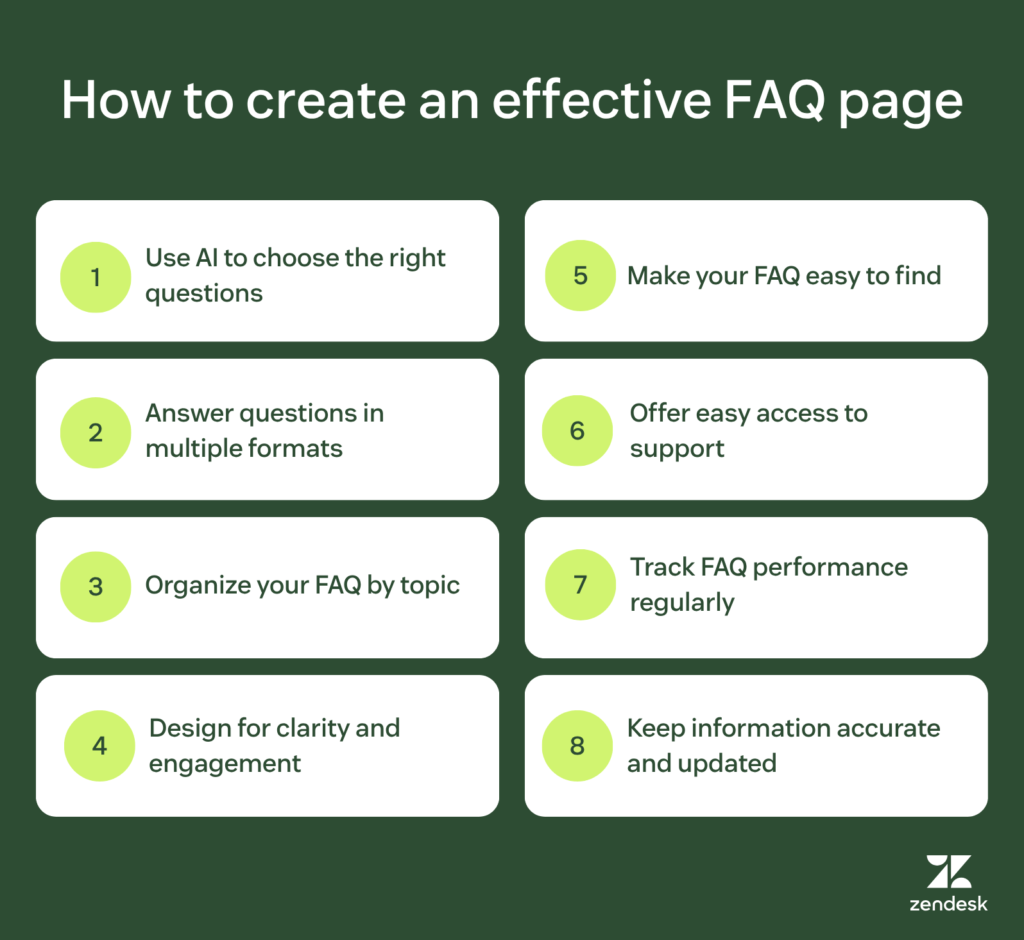
Creating an FAQ Page That Reduces Support Requests Every support email costs time and money. Many of those emails ask the same questions repeatedly—questions a well-designed FAQ page could answer instantly. An effective FAQ doesn’t just help customers; it frees your team to handle issues that genuinely need human attention. At Proton Tech Lab, we design FAQ pages that actually get used. Let’s explore how to create FAQs that answer questions before customers need to ask them. Start with Real Questions According to Zendesk, the best FAQs come from actual customer inquiries. Review support tickets, chat logs, and emails to identify questions that recur frequently. These real questions should form your FAQ foundation. Avoid inventing questions customers don’t actually ask. Made-up FAQs often miss what people genuinely need to know while cluttering the page with irrelevant content. Organize by Topic Group related questions together under clear category headings. Shipping questions in one section, returns in another, account issues in a third. Logical organization helps visitors find relevant answers quickly. Long, unorganized lists of questions overwhelm visitors. They’ll contact support rather than scroll through dozens of unrelated items. Structure reduces friction. Write Clear, Complete Answers Vague answers generate follow-up questions. “Shipping takes a few days” is less helpful than “Standard shipping takes 3-5 business days within the continental US.” Be specific enough that readers don’t need additional clarification. But avoid unnecessary length. Answer the question directly, then stop. Readers scanning for quick answers don’t want to wade through paragraphs of context. Use Customer Language Write questions the way customers actually ask them, not in formal corporate language. “How do I return something?” reads more naturally than “What is the procedure for initiating a product return?” Match your customers’ vocabulary. This also helps with search—both site search and Google. Customers searching with natural language find answers written the same way. Add Search Functionality Search lets visitors jump directly to relevant answers without browsing. Even well-organized FAQs benefit from search when visitors know exactly what they’re looking for. Make the search box prominent and functional. Use Expandable Sections Accordion-style FAQs show questions while hiding answers until clicked. This lets visitors scan all questions quickly without scrolling through every answer. When they find their question, one click reveals the answer. This design pattern keeps pages manageable while accommodating comprehensive content. Visitors see the scope of your FAQ without being overwhelmed by its volume. Include Visual Aids Some answers work better with images, screenshots, or videos. “Click the gear icon in the top right corner” becomes clearer with a screenshot showing exactly where to click. Use visuals when they genuinely clarify; skip them when text suffices. Link to Detailed Resources FAQ answers should be concise, but some topics need more depth. Link to full articles, tutorials, or documentation for complex subjects. The FAQ provides quick answers; linked resources provide complete understanding. Provide Escape Routes Not every question has an FAQ answer. Make it easy to contact support when self-service doesn’t solve the problem. Include clear contact options on your FAQ page—but after presenting relevant answers, not before. Keep It Updated Outdated FAQs erode trust and generate confusion. When policies change, products update, or new questions emerge, update your FAQ accordingly. Schedule regular reviews to catch stale content. Measure and Improve Track which FAQ entries get viewed most. Monitor whether support requests decrease. Ask for feedback on whether answers were helpful. Use data to continuously improve your FAQ effectiveness. Answer Questions Before They’re Asked A well-designed FAQ page empowers customers to help themselves while reducing demands on your support team. Invest in getting it right, and both your customers and your team benefit. Need help with your FAQ page? At Proton Tech Lab, we design self-service resources that actually work. Contact us today to discuss your website needs. Let’s reduce those support requests!
Web Design

Choosing Website Colors That Reflect Your Brand Personality

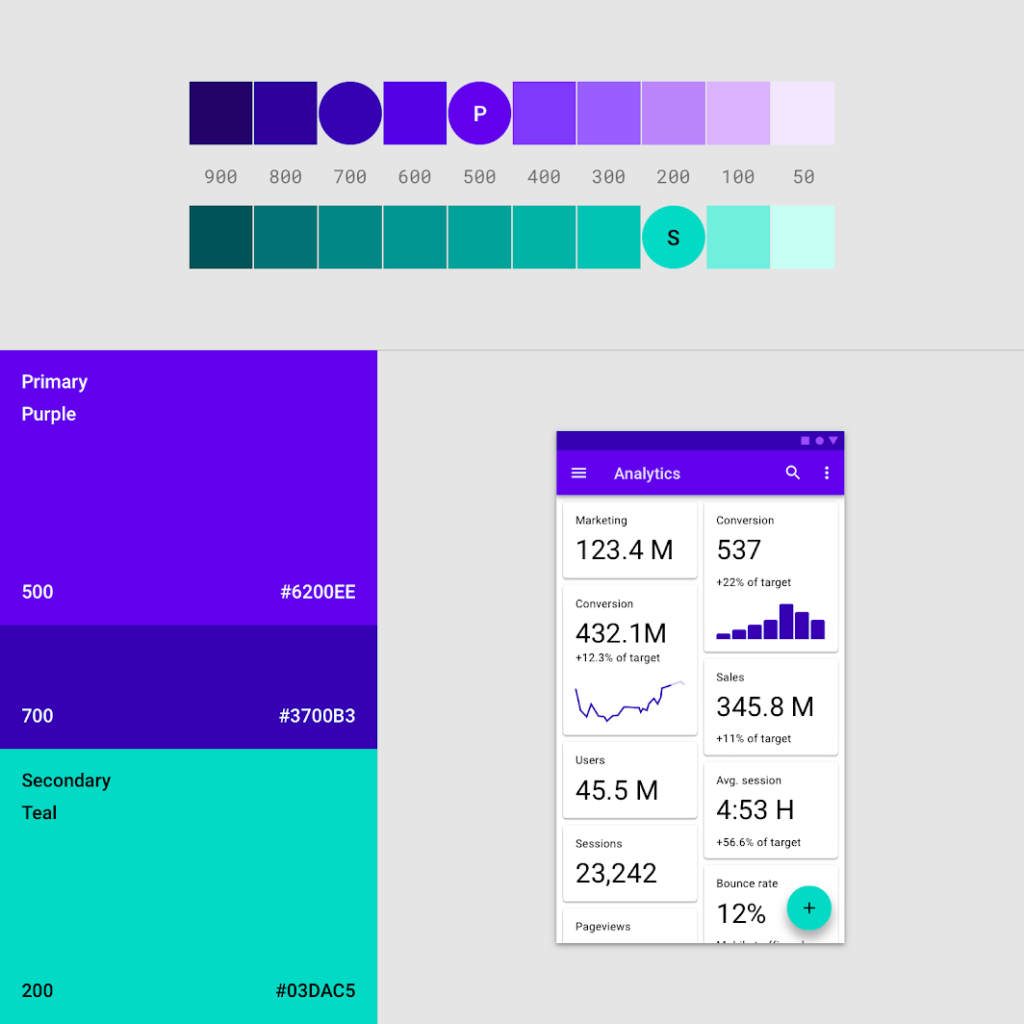
Choosing Website Colors That Reflect Your Brand Personality Color speaks before words do. Within seconds of landing on your website, visitors form impressions based largely on color. The wrong palette undermines your message; the right one reinforces everything you want to communicate about your brand. At Proton Tech Lab, we design websites with intentional color strategies. Let’s explore how to choose colors that reflect your brand personality and influence visitor behavior. The Psychology of Color According to Color Psychology, colors trigger emotional and psychological responses. Blue conveys trust and professionalism—hence its dominance in finance and technology. Red creates urgency and excitement—effective for sales and entertainment. These associations aren’t arbitrary; they’re deeply ingrained. Understanding color psychology helps you choose strategically rather than based on personal preference alone. Your favorite color might not serve your brand’s needs. Common Color Associations Blue: Trust, stability, professionalism, calm. Popular with banks, healthcare, and technology companies. Red: Energy, urgency, passion, excitement. Effective for calls to action, sales, and entertainment. Green: Nature, growth, health, wealth. Common in environmental, financial, and wellness brands. Yellow: Optimism, warmth, caution, creativity. Attention-grabbing but overwhelming in large amounts. Purple: Luxury, creativity, wisdom, spirituality. Associated with premium and imaginative brands. Orange: Friendliness, confidence, enthusiasm. Energetic without red’s intensity. Black: Sophistication, power, elegance, luxury. Creates striking contrast and premium feel. Start with Brand Personality Define your brand personality before selecting colors. Are you playful or serious? Traditional or innovative? Accessible or exclusive? Your color palette should express these traits visually. A children’s education site and a corporate law firm both need effective colors—but vastly different ones. Let personality guide your palette rather than following generic trends. Build a Complete Palette Effective websites use more than one color. Build a palette with clear roles: primary colors that dominate, secondary colors that support, accent colors for emphasis, and neutral colors for backgrounds and text. Most websites work well with one or two primary colors, one or two accent colors, and a range of neutrals. Too many colors create chaos; too few feel flat. Consider Contrast and Accessibility Beautiful colors mean nothing if text is unreadable. Ensure sufficient contrast between text and background colors. Dark text on light backgrounds or light text on dark backgrounds—avoid low-contrast combinations that strain eyes. Accessibility guidelines specify minimum contrast ratios. Test your combinations with contrast checking tools to ensure everyone can read your content. Use Color to Guide Action Reserve your most attention-grabbing color for calls to action. If everything is bright and bold, nothing stands out. Accent colors work best when used sparingly for elements you want visitors to notice and click. Test Across Devices Colors display differently on different screens. What looks perfect on your monitor may appear different on phones, tablets, or other computers. Test your palette across devices to ensure consistency. Look at Competitors Research what colors dominate your industry. You might want to fit in with established conventions or deliberately stand out. A financial services company using bright pink would certainly differentiate—whether that’s strategic or off-putting depends on context. Document Your Choices Record exact color codes (HEX, RGB) so colors remain consistent across your website and other materials. Approximate colors weaken brand recognition. Precision matters. Let Color Work for You Strategic color choices shape how visitors perceive your brand and interact with your site. Invest thought into your palette and let color communicate your personality before visitors read a single word. Need help choosing website colors? At Proton Tech Lab, we design websites with strategic color palettes that reinforce brand identity. Contact us today to discuss your project. Let’s find colors that speak for your brand!

Web Design

Writing Call to Action Buttons That Actually Get Clicked

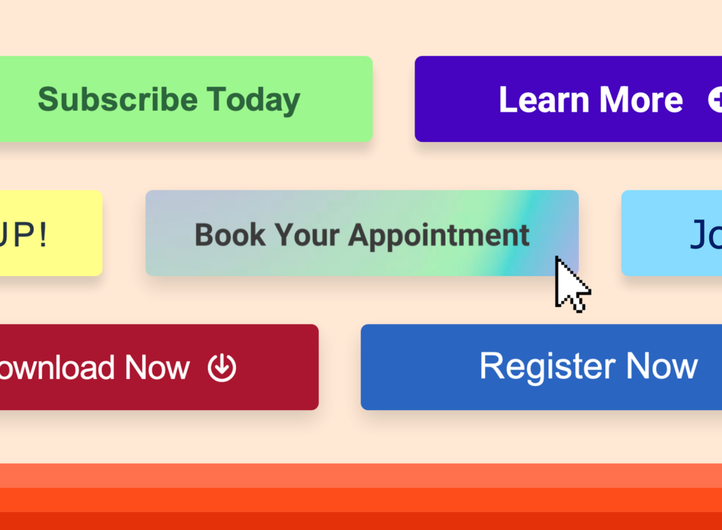
Writing Call to Action Buttons That Actually Get Clicked Your call to action button is the moment of truth. Everything else on your page—the headlines, images, copy—leads visitors here. A weak CTA wastes that effort. A compelling CTA converts browsers into customers, subscribers, or leads. At Proton Tech Lab, we design CTAs that drive action. Let’s explore how to write buttons that actually get clicked. Start with Action Verbs According to HubSpot, CTAs beginning with verbs outperform passive alternatives. “Get Your Free Guide” beats “Free Guide Available.” “Start Your Trial” beats “Trial Information.” Verbs create momentum and tell visitors exactly what to do. Strong action verbs include: Get, Start, Join, Download, Discover, Learn, Try, Claim, Build, Create. Choose verbs that match your offer and create appropriate energy. Be Specific About Value “Submit” tells visitors nothing about what they’ll receive. “Get My Free Quote” promises specific value. Specificity reduces uncertainty and increases clicks. Visitors should know exactly what happens when they click. The best CTAs answer “what’s in it for me?” immediately. Focus on the benefit visitors receive, not the action you want them to take. Create Urgency Without Pressure Urgency motivates action. “Start Your Free Trial Today” suggests acting now matters. “Limited Spots Available” creates scarcity. But false urgency backfires when visitors see through it. Use genuine urgency when it exists—actual deadlines, real limited availability, true time-sensitive offers. Manufactured urgency erodes trust. Reduce Perceived Risk Clicking feels like commitment. Reduce that friction with reassuring language. “Try Free for 30 Days” removes financial risk. “No Credit Card Required” removes signup friction. “Cancel Anytime” removes commitment fear. Address objections within or near your CTA. If visitors hesitate because of risk, neutralize that risk explicitly. Use First Person “Start My Free Trial” often outperforms “Start Your Free Trial.” First person language creates ownership before the action completes. The offer feels more personal when phrased from the visitor’s perspective. This technique works particularly well for subscriptions, memberships, and personalized offers where ownership matters. Keep It Short Button text should be scannable. Two to five words typically work best. Longer CTAs feel like reading; shorter CTAs feel like acting. Every word must earn its place. If you need more context, put it near the button rather than on it. The button itself should be crisp and immediate. Make Buttons Look Clickable CTA effectiveness isn’t just copy—it’s design. Buttons should look like buttons: contrasting colors, clear borders, adequate size. They should stand out from surrounding elements and invite clicking. Mobile users need large enough tap targets. Buttons that work for mouse clicks may frustrate thumbs. Test on actual devices. Position Strategically Place CTAs where visitors are ready to act. After compelling copy that builds interest. At natural decision points. Above the fold for immediate options; below for visitors who need more information first. Multiple CTAs on long pages catch visitors at different stages of readiness. But don’t overwhelm—each CTA should feel like a natural next step. Test and Refine Small changes in CTA copy can significantly impact conversion rates. A/B test different versions: different verbs, value propositions, lengths. Data reveals what resonates with your specific audience. Turn Visitors into Action Takers Your CTA is where interest becomes action. Craft it carefully, test it rigorously, and optimize it continuously. The right words on that button can transform your conversion rates. Need help with your website CTAs? At Proton Tech Lab, we optimize every element for conversion. Contact us today to discuss your website goals. Let’s create CTAs that convert!

Web Design

What to Include in Your Website Footer for Maximum Impact

What to Include in Your Website Footer for Maximum Impact The footer is where visitors look when they can’t find what they need elsewhere. It’s the last chance to help them before they leave. Yet many websites treat footers as afterthoughts, cramming in random links or leaving them nearly empty. A strategic footer serves visitors and strengthens your site. At Proton Tech Lab, we design footers that work as hard as the rest of your site. Let’s explore what to include for maximum impact. Contact Information According to Nielsen Norman Group, users expect contact information in footers. Include your phone number, email address, and physical address if you have one. Make phone numbers clickable for mobile users. For businesses serving specific areas, displaying your address helps local SEO. Even if customers never visit your location, search engines use this information for local rankings. Navigation Links Footers provide secondary navigation for visitors who’ve scrolled past the header menu. Include links to important pages: About, Services, Products, Contact, FAQ. This helps visitors who missed navigation options above. Organize footer links logically. Group related pages under clear headings. Don’t overwhelm with every page on your site; prioritize what visitors most need to find. [IMAGE: Footer navigation organized into clear categories with logical groupings of links] Social Media Links Social media icons belong in footers. They’re expected there and don’t distract from primary content higher on the page. Link to profiles you actively maintain; dead social accounts hurt credibility. Use recognizable icons and ensure they open in new tabs so visitors don’t leave your site entirely. Keep icons consistent in style and size for a polished look. Newsletter Signup If you have a newsletter, the footer is prime real estate for signup forms. Visitors who scroll to the bottom have engaged with your content; they’re good candidates for ongoing communication. Keep the form simple—email address and a submit button. Lengthy forms in footers feel out of place. Save detailed preferences for after they’ve subscribed. Legal Pages Privacy policies, terms of service, and cookie policies belong in footers. These pages are legally required in many contexts but don’t need prominent placement. Footer links satisfy requirements without cluttering main navigation. Copyright notices also live here. Include the current year and your business name. Some sites use scripts to update the year automatically so it never appears outdated. Trust Signals Awards, certifications, security badges, and association memberships can appear in footers. These trust signals reinforce credibility without interrupting content flow above. Payment method icons reassure e-commerce visitors that their preferred payment options are accepted. Security certifications reduce checkout anxiety. [IMAGE: Footer trust section showing security badges, payment icons, and certification logos] Brief Company Description A short tagline or company description helps visitors who land on interior pages understand who you are. One or two sentences about what you do provides context without requiring navigation to your About page. Call to Action Some footers include a final call to action: request a quote, schedule a consultation, start a free trial. This catches visitors who’ve consumed your content and are ready to act. Sitemap Link An HTML sitemap helps visitors and search engines find all your pages. A footer link to your sitemap aids navigation and supports SEO by ensuring all pages are discoverable. Design Considerations Visually distinguish your footer from content above. Different background colors clearly signal the page has ended. Maintain readability with sufficient contrast and reasonable text sizes. Keep footers consistent across all pages. Visitors rely on footers being predictable. Changing footer content page-to-page creates confusion. Make Your Footer Work A thoughtful footer serves visitors who need information and strengthens your site’s structure for search engines. Don’t waste this valuable real estate. Make every element earn its place. Need help optimizing your website footer? At Proton Tech Lab, we design every element to serve your visitors. Contact us today to discuss your website needs. Let’s make your footer work harder!

Web Design

Signs Your Business Website Needs a Redesign

Signs Your Business Website Needs a Redesign Your website looked great when it launched. But the internet evolves constantly, and what impressed visitors three years ago may embarrass you today. An outdated website doesn’t just look bad; it actively hurts your business by driving away potential customers. At Proton Tech Lab, we help businesses recognize when redesign becomes necessary. Let’s explore the warning signs that indicate your website needs a refresh. Your Site Isn’t Mobile Friendly According to Statista, mobile devices generate over half of global web traffic. If your website doesn’t work beautifully on phones, you’re frustrating most of your visitors. Pinching, zooming, and horizontal scrolling send visitors straight to competitors. Google also prioritizes mobile-friendly sites in search rankings. A non-responsive website hurts both user experience and search visibility simultaneously. High Bounce Rates When visitors leave your site quickly without interacting, something’s wrong. High bounce rates suggest your website fails to engage visitors or meet their expectations. They arrived, saw what you offered, and decided to look elsewhere. Outdated design, slow loading, confusing navigation, or irrelevant content all contribute to bounces. If your analytics show visitors fleeing, your website needs attention. Slow Loading Times Modern users expect near-instant loading. If your website takes more than three seconds to appear, visitors leave before seeing your content. Slow sites feel broken, regardless of how good they look once loaded. Older websites often carry technical debt: bloated code, unoptimized images, and outdated infrastructure that slows everything down. Sometimes a complete rebuild runs faster than patching an old foundation. Your Design Looks Dated Web design trends evolve. What looked cutting-edge in 2018 may scream outdated today. Flash animations, cluttered layouts, small text, and skeuomorphic design elements immediately date your site. Visitors judge your business by your website’s appearance. An old-looking site suggests an old-fashioned company. Even if that’s unfair, first impressions form instantly and resist correction. Difficult Content Updates If updating your website requires a developer for every small change, you’ll stop making updates. Outdated information—old team members, discontinued products, past events—makes your business look neglected. Modern content management systems let non-technical staff update content easily. If your current site doesn’t offer this flexibility, a redesign can dramatically improve your ability to keep content fresh. Poor Conversion Rates Your website should generate leads, sales, or whatever actions drive your business. If conversion rates are low despite decent traffic, your website isn’t doing its job. Something in the design, messaging, or user experience fails to convince visitors to act. Security Vulnerabilities Older websites built on outdated platforms may have security holes. If your site lacks HTTPS, runs on unsupported software, or hasn’t received security updates, you’re vulnerable to attacks that could compromise customer data and your reputation. Your Business Has Changed Businesses evolve. New services, different target audiences, updated branding—if your business has changed significantly, your website should reflect those changes. A site built for who you were may not serve who you’ve become. Competitors Look Better Check your competitors’ websites. If they look significantly more modern and professional than yours, potential customers will notice. They’ll assume the competitor who invested in their website also invests more in their products and services. You’re Embarrassed to Share It This simple gut check matters. If you hesitate to include your website on business cards or avoid directing prospects there, you already know something’s wrong. Your website should be a point of pride, not embarrassment. Time for a Fresh Start Recognizing these signs is the first step. A website redesign is an investment, but so is every day your current site underperforms. A modern, effective website pays for itself through improved customer experience and increased conversions. Ready for a website redesign? At Proton Tech Lab, we transform outdated websites into modern assets that drive business growth. Contact us today for a free website assessment. Let’s build something you’re proud to share!

Web Design

Reducing Cart Abandonment with Better Checkout Page Design

Reducing Cart Abandonment with Better Checkout Page Design Customers fill their carts, start checkout, then vanish. It happens constantly, and it’s costing you sales. The average cart abandonment rate hovers around 70%, meaning most shoppers who intend to buy never complete their purchase. Often, the checkout page itself is the problem. At Proton Tech Lab, we design checkout experiences that convert browsers into buyers. Let’s explore simple improvements that help more customers complete their purchases. Why Customers Abandon Carts According to Baymard Institute, top reasons for cart abandonment include unexpected costs, required account creation, complicated checkout processes, concerns about payment security, and website errors. Most of these problems are fixable through better design. Understanding why customers leave helps you address the right issues. Analyze your checkout funnel to identify where exactly customers drop off, then focus improvements there. Offer Guest Checkout Forcing account creation kills conversions. Many customers want to buy quickly without creating yet another password to remember. Offer guest checkout prominently, making account creation optional. You can still encourage accounts by highlighting benefits: order tracking, faster future checkouts, exclusive offers. But let customers choose rather than forcing them. Show All Costs Upfront Surprise costs at checkout frustrate customers. Shipping fees, taxes, and handling charges that appear only at the final step feel like bait and switch. Customers abandon rather than accept unexpected expenses. Display shipping costs early, ideally on product pages or in the cart before checkout begins. Shipping calculators that estimate costs by zip code set accurate expectations. No surprises means fewer abandoned carts. Simplify Form Fields Every field you add increases friction. Ask only for information you genuinely need. Do you really need a phone number? A company name? A fax number? Remove anything non-essential. Use smart defaults and autofill whenever possible. Auto-detect country from IP address. Suggest city and state from zip code. Enable browser autofill for common fields. Make completing forms as effortless as possible. Use a Single-Page Checkout Multi-page checkouts feel endless. Each page load is an opportunity for customers to reconsider. Single-page checkouts that show everything at once feel faster and simpler, even if they contain the same fields. If you must use multiple pages, show a progress indicator so customers know how many steps remain. Uncertainty about checkout length increases abandonment. Display Security Signals Customers worry about payment security, especially on unfamiliar sites. Display security badges, SSL indicators, and trusted payment logos near credit card fields. These visual signals reassure customers their data is safe. Payment options like PayPal offer buyer protection that some customers prefer. Offering multiple payment methods lets customers choose what feels most secure to them. Optimize for Mobile Mobile shopping continues growing, but mobile checkout abandonment rates exceed desktop. Small screens, awkward typing, and poorly designed mobile forms frustrate shoppers. Design mobile checkout specifically for thumbs and small screens. Large tap targets, appropriate keyboard types for each field, and minimal scrolling improve mobile completion rates. Digital wallet options like Apple Pay and Google Pay streamline mobile checkout significantly. Handle Errors Gracefully Confusing error messages drive customers away. When validation fails, explain exactly what’s wrong and how to fix it. Highlight the specific field with the error. Don’t clear the entire form when something goes wrong. Validate in real-time when possible so customers know immediately if something’s wrong, rather than discovering errors after submitting. Show Order Summary Keep a visible order summary throughout checkout showing what customers are buying, quantities, and total cost. This prevents the need to navigate back to verify cart contents and reduces uncertainty about the purchase. Implement Cart Recovery Even with perfect checkout design, some abandonment will occur. Cart recovery emails remind customers about items they left behind. These emails often recover a meaningful percentage of otherwise lost sales. Turn Browsers into Buyers A better checkout experience directly impacts your bottom line. By removing friction, building trust, and simplifying the process, you help more customers complete the purchases they intended to make. Ready to reduce cart abandonment? At Proton Tech Lab, we design checkout experiences that convert. Contact us today to discuss your ecommerce optimization. Let’s turn more of your shoppers into customers!

Web Design

The Hidden Costs of Website Downtime for Your Business

The Hidden Costs of Website Downtime for Your Business Your website goes down. Maybe for an hour, maybe for a day. It happens to everyone eventually. But do you know what that downtime actually costs your business? Beyond the obvious lost sales, website outages create ripple effects that damage your business long after the site comes back online. At Proton Tech Lab, we help businesses minimize downtime through reliable hosting and proactive maintenance. Let’s explore the true costs of website outages and how to prevent them. Direct Revenue Loss The most obvious cost is lost sales. According to Gartner, the average cost of IT downtime is around $5,600 per minute for larger enterprises. For small businesses, the numbers are smaller but proportionally just as painful. Calculate your hourly revenue and imagine losing it entirely during an outage. E-commerce sites lose every sale that would have occurred. Service businesses lose inquiry forms and appointment bookings. Every minute offline is money gone forever. Lost Customer Trust When visitors encounter an unavailable website, they form negative impressions. Is this business reliable? Are they still operating? Can I trust them with my order? These doubts linger even after your site returns. First-time visitors who hit downtime rarely return. They simply move to competitors who are online and ready to serve them. You’ll never know how many potential customers you lost because they found your site down. Search Engine Ranking Damage Google’s crawlers visit your site regularly. If they encounter errors during these visits, your search rankings can suffer. Frequent or extended downtime signals unreliability, which search engines factor into rankings. Even after your site recovers, regaining lost ranking positions takes time. The SEO damage from significant downtime can affect your visibility for weeks or months afterward. Wasted Marketing Spend Running paid advertising during an outage burns money with zero return. Every click from Google Ads, Facebook campaigns, or other paid channels leads to an error page. You pay for traffic that can’t convert. Email campaigns sent during downtime drive subscribers to broken pages, damaging both the campaign’s effectiveness and subscriber trust. Marketing efforts require a functioning website to deliver results. Productivity Losses Website downtime often affects internal operations too. Staff can’t access tools, information, or systems they need. Customer service can’t look up orders. Sales can’t demonstrate products. Operations slow across the organization. Then there’s the scramble to fix the problem. Technical staff drop everything to restore the site. Leadership gets involved. Communication overhead multiplies. The disruption extends far beyond the website itself. Reputation and Brand Damage Social media amplifies outage awareness. Frustrated customers tweet complaints. Reviews mention reliability problems. News spreads faster than you can fix the underlying issue. For some businesses, a major outage becomes part of their public narrative. Competitors may even capitalize on your downtime, positioning themselves as more reliable alternatives. Preventing Website Downtime Most downtime is preventable with proper precautions. Quality Hosting: Choose hosts with strong uptime records, redundant infrastructure, and quick support response times. Regular Maintenance: Keep software updated, monitor performance, and address issues before they cause failures. Monitoring Systems: Use uptime monitoring to detect outages immediately, minimizing response time. Backup Systems: Maintain current backups so recovery is fast if something goes wrong. Security Measures: Many outages result from security breaches. Strong security prevents these incidents. Having a Response Plan When outages occur, response speed matters. Know who to contact, what steps to take, and how to communicate with customers. A clear plan reduces downtime duration and minimizes damage. Keep Your Website Running Website downtime costs more than most businesses realize. Lost revenue, damaged trust, hurt rankings, and wasted marketing all add up. Investing in reliability prevents these costs and keeps your business running smoothly. Worried about your website’s reliability? At Proton Tech Lab, we provide hosting and maintenance that minimizes downtime risk. Contact us today to discuss keeping your website running reliably. Don’t let downtime cost your business!

Web Design

Building Trust Online: Essential Elements Every Business Website Needs

Building Trust Online: Essential Elements Every Business Website Needs When visitors land on your website, they’re asking themselves one crucial question: can I trust this business? Within seconds, they’re scanning for signals that tell them whether to stay or leave. In a world full of online scams and unreliable vendors, trust signals aren’t optional; they’re essential for converting visitors into customers. At Proton Tech Lab, we build websites designed to establish trust from the first impression. Let’s explore the essential trust elements your business website needs to convert skeptical visitors into confident customers. Why Trust Signals Matter Online shoppers can’t touch products, meet staff, or walk through your store. They rely entirely on what your website communicates. According to Baymard Institute, 18% of shoppers abandon carts because they don’t trust the site with their payment information. Trust issues directly cost businesses sales. Trust signals are visual and textual elements that demonstrate credibility, security, and reliability. They answer unspoken concerns and reduce the perceived risk of doing business with you. Professional Design and Functionality First impressions form in milliseconds. An outdated, cluttered, or broken website immediately signals unprofessionalism. Visitors assume that if you can’t maintain your website, you probably can’t deliver quality products or services either. Invest in clean, modern design. Ensure everything works: links, forms, images, and navigation. Mobile responsiveness isn’t optional anymore. A polished, functional website is the foundation of online trust. Customer Reviews and Testimonials Nothing builds trust like hearing from other customers. Reviews and testimonials provide social proof that real people have purchased from you and had positive experiences. They’re more believable than anything you say about yourself. Display reviews prominently on product pages, service pages, and your homepage. Include customer names and photos when possible for added authenticity. Don’t hide negative reviews; responding professionally to criticism actually builds trust. Security Badges and SSL Certificates Security concerns top the list of reasons people abandon online purchases. Display security badges from recognized providers like Norton, McAfee, or your payment processor. These visual indicators reassure visitors that their data is protected. An SSL certificate is non-negotiable. The padlock icon and ‘https’ in your URL signal encrypted connections. Browsers now warn users about unsecured sites, so lacking SSL actively damages trust and drives visitors away. Clear Contact Information Legitimate businesses aren’t hard to reach. Display your phone number, email, and physical address prominently. A dedicated contact page with multiple ways to reach you signals that real people stand behind the website. Consider adding live chat for immediate accessibility. Even if visitors don’t use it, seeing the option suggests responsiveness and customer care. Hiding contact information makes businesses look like they have something to hide. About Us Page with Real People People buy from people, not faceless corporations. Your About page should introduce the humans behind your business. Include photos of your team, your story, your mission, and what makes you different. Share your history and expertise. Explain why you do what you do. Authenticity resonates with visitors and creates emotional connection that generic corporate language cannot achieve. Trust Badges and Certifications Industry certifications, professional memberships, and trust badges from organizations like the Better Business Bureau signal legitimacy. Awards and recognition from respected sources add credibility. Display logos of well-known clients or partners if applicable. Association with recognized brands transfers some of their credibility to you. Place these badges where visitors naturally look: near calls to action and checkout areas. Clear Policies Transparent policies demonstrate that you operate professionally and fairly. Display your return policy, shipping information, privacy policy, and terms of service clearly. Make them easy to find and easy to understand. Generous return policies actually increase conversions by reducing purchase anxiety. When customers know they can return items easily, they’re more willing to take the initial risk of buying. Payment Options Offering multiple payment methods signals established, trustworthy operations. Display logos for accepted payment types: major credit cards, PayPal, Apple Pay, and other recognized payment processors. Trusted payment options like PayPal offer buyer protection that reassures hesitant customers. The more recognized payment methods you accept, the more professional and reliable you appear. Social Media Presence Active social media profiles demonstrate that your business is real and engaged. Link to your social accounts from your website. Regular posting and responsive interaction show you’re active and accessible. Social proof extends to follower counts and engagement. While you shouldn’t obsess over numbers, established social presence adds another layer of credibility verification. Build a Website People Trust Trust isn’t built through any single element but through the accumulation of signals throughout your website. Each trust indicator reduces friction and moves visitors closer to becoming customers. Ready to build a website that earns customer trust? At Proton Tech Lab, we design websites with trust signals strategically placed to maximize conversions. Contact us today to discuss your website’s trust factors. We’ll help you create an online presence that visitors trust and customers love!

Web Design

Why Dark Mode Is Essential for Modern Website Design

Why Dark Mode Is Essential for Modern Website Design Open any popular app today, whether it’s Twitter, Instagram, or YouTube, and you’ll find a dark mode option. What started as a niche feature for developers has become a mainstream expectation. Users now actively seek dark mode, and websites that offer it gain a significant advantage in user satisfaction. At Proton Tech Lab, we design websites with dark mode capabilities that enhance user experience. Let’s explore why dark mode has become essential for modern websites and how it can benefit your business. What Is Dark Mode? Dark mode is a display setting that uses light-colored text, icons, and interface elements on dark backgrounds. Instead of the traditional black text on white backgrounds, dark mode reverses this scheme. The result is a visually distinct experience that many users find more comfortable, especially in low-light environments. According to Android Authority, over 80% of users prefer dark mode when given the option. This overwhelming preference makes dark mode not just a nice feature but a user expectation that businesses should consider meeting. Reducing Eye Strain and Fatigue The most cited benefit of dark mode is reduced eye strain. Bright white screens in dark environments force eyes to work harder, adjusting constantly between the bright display and dim surroundings. This causes fatigue, headaches, and discomfort during extended screen time. Dark mode reduces the contrast between screen and environment in low-light settings, creating a more comfortable viewing experience. For users browsing at night or in dimly lit offices, dark mode can significantly reduce visual discomfort. Saving Battery Life For devices with OLED or AMOLED screens, dark mode offers real power savings. These screens illuminate individual pixels, meaning black pixels are essentially turned off. Darker interfaces require less power to display, extending battery life noticeably. As mobile browsing continues to dominate web traffic, offering a battery-friendly experience matters. Users appreciate websites that don’t drain their devices, and dark mode contributes to this efficiency on compatible screens. Improving Accessibility Dark mode can improve accessibility for users with certain visual sensitivities. Some people with photophobia, migraines, or visual impairments find dark interfaces easier to use. Providing dark mode demonstrates commitment to inclusive design. However, dark mode isn’t universally better for accessibility. Some users, particularly those with certain types of astigmatism, may find light text on dark backgrounds harder to read. The key is offering choice rather than forcing one mode on everyone. Creating Visual Impact Dark backgrounds make colors pop in ways that light backgrounds cannot. Images, videos, and colorful design elements stand out dramatically against dark surroundings. For portfolios, galleries, and visually-driven websites, dark mode can create stunning presentations. Many premium and luxury brands use dark interfaces to convey sophistication and elegance. Dark mode naturally creates a sense of exclusivity and modern aesthetics that certain brand identities benefit from. Implementing Dark Mode Effectively Good dark mode implementation requires more than inverting colors. Simply flipping black and white creates harsh, uncomfortable interfaces. Effective dark mode uses dark grays rather than pure black, carefully considers contrast ratios, and adjusts all design elements thoughtfully. Key Implementation Tips: Use dark gray backgrounds instead of pure black for softer appearance. Ensure text contrast meets accessibility standards. Adjust image brightness and shadows for dark contexts. Test thoroughly across devices and lighting conditions. Letting Users Choose The best approach gives users control. Implement a toggle that lets visitors switch between light and dark modes based on their preference. Many sites also respect system preferences, automatically displaying dark mode when users have enabled it at the operating system level. Remember user preferences across sessions so visitors don’t need to reset their choice each visit. This small touch significantly improves user experience. Considering Your Brand Not every brand suits dark mode equally. Consider whether dark interfaces align with your brand identity. Some brands, particularly those emphasizing brightness, cleanliness, or airiness, may find dark mode conflicts with their core aesthetic. That said, offering dark mode as an option doesn’t mean abandoning your brand’s primary appearance. It shows user consideration while maintaining brand integrity in your default presentation. Give Your Users What They Want Dark mode has evolved from optional feature to user expectation. Offering it demonstrates attention to user comfort, modern design sensibility, and commitment to accessibility. In competitive digital landscapes, these details matter. Ready to add dark mode to your website? At Proton Tech Lab, we design and implement dark mode experiences that look great and work seamlessly. Contact us today to discuss modernizing your website with dark mode. Let’s create an experience your users will love, day or night!

Web Design

Making Your Website Accessible to All Users in 2025

Making Your Website Accessible to All Users in 2025 Over one billion people worldwide live with some form of disability. When your website isn’t accessible, you’re not just excluding a significant portion of potential customers; you may also be exposing your business to legal risk. Web accessibility isn’t just the right thing to do; it’s smart business. At Proton Tech Lab, we build websites that work for everyone. Let’s explore what web accessibility means, why it matters, and how to make your website inclusive for all users. What Is Web Accessibility? Web accessibility means designing and developing websites so that people with disabilities can use them effectively. This includes people with visual, auditory, physical, speech, cognitive, and neurological disabilities. Accessible websites work with assistive technologies like screen readers, voice recognition software, and alternative input devices. According to the World Wide Web Consortium (W3C), web accessibility also benefits people without disabilities, including those using mobile phones, smart watches, or slow internet connections, older individuals with changing abilities, and people with temporary disabilities like a broken arm. The Business Case for Accessibility Beyond ethical considerations, accessibility makes business sense. The disability community represents significant purchasing power. In the United States alone, adults with disabilities control over $500 billion in disposable income. Globally, this figure reaches into the trillions. Accessible websites also tend to perform better overall. Many accessibility improvements enhance user experience for everyone, improve search engine optimization, and reduce maintenance costs. Plus, accessibility lawsuits are increasing, making compliance an important risk management consideration. Understanding WCAG Guidelines The Web Content Accessibility Guidelines (WCAG) provide the internationally recognized standards for web accessibility. These guidelines are organized around four principles, often remembered by the acronym POUR: Perceivable, Operable, Understandable, and Robust. Perceivable: Users must be able to perceive the information being presented. This means providing text alternatives for non-text content, captions for videos, and content that can be presented in different ways. Operable: Users must be able to operate the interface. Navigation must work via keyboard, users need enough time to read content, and nothing should cause seizures or physical reactions. Understandable: Information and operation must be understandable. Text should be readable, pages should work predictably, and users should receive help avoiding and correcting mistakes. Robust: Content must work with current and future technologies, including assistive technologies. Provide Text Alternatives for Images Every image on your website should have alternative text that describes its content or function. Screen readers read this alt text to visually impaired users, helping them understand what the image conveys. Write alt text that communicates the image’s purpose, not just its appearance. For decorative images that don’t add information, use empty alt attributes so screen readers skip them. For complex images like charts, provide detailed descriptions nearby. Ensure Keyboard Navigation Many users navigate websites using only a keyboard, without a mouse. All functionality must be accessible via keyboard, including navigation menus, forms, buttons, and interactive elements. Test your website by unplugging your mouse and navigating with Tab, Enter, and arrow keys. Can you reach every element? Can you tell where you are on the page? If keyboard navigation fails anywhere, those areas need attention. Use Sufficient Color Contrast Text must have sufficient contrast against its background to be readable by people with low vision or color blindness. WCAG requires a contrast ratio of at least 4.5:1 for normal text and 3:1 for large text. Use contrast checking tools to verify your color combinations meet standards. Avoid conveying information through color alone; add text labels or patterns so colorblind users don’t miss important distinctions. Structure Content Properly Proper heading structure helps screen reader users navigate and understand your content. Use heading levels hierarchically: H1 for the main title, H2 for major sections, H3 for subsections, and so on. Don’t skip levels or use headings just for visual styling. Use semantic HTML elements like nav, main, article, and footer to define page regions. These landmarks help assistive technology users jump directly to different sections of the page. Make Forms Accessible Forms present particular accessibility challenges. Every form field needs a visible, properly associated label. Error messages should clearly explain what went wrong and how to fix it. Required fields should be marked clearly. Ensure forms work with autocomplete to help users fill in common information. Group related fields logically. Provide clear instructions before users encounter form elements. Make submit buttons descriptive rather than generic. Add Captions and Transcripts Video content needs captions for deaf and hard-of-hearing users. Audio content needs transcripts. These alternatives also benefit users in sound-sensitive environments and those who prefer reading to listening. Captions should be accurate, synchronized, and include relevant non-speech audio like music or sound effects. Auto-generated captions are a starting point but typically require editing for accuracy. Test with Real Users and Tools Automated testing tools can identify many accessibility issues, but they can’t catch everything. Combine automated testing with manual testing and, ideally, testing by people with disabilities who use assistive technologies daily. Try using your website with a screen reader. Navigate with keyboard only. Use browser extensions that simulate color blindness. These experiences reveal issues that technical audits might miss. Make Your Website Welcome Everyone Accessibility is an ongoing commitment, not a one-time project. As you add new content and features, maintain accessibility standards. The result is a website that works better for everyone and demonstrates your commitment to inclusive design. Ready to make your website accessible to all users? At Proton Tech Lab, we build accessible websites that meet WCAG standards and serve your entire audience. Contact us today for an accessibility audit of your current site. We’ll identify issues and help you create a website that welcomes everyone. Let’s make the web accessible together!

Scroll to Top