
Designing Mobile Navigation That Actually Works
Most website visitors use phones. Yet mobile navigation often frustrates—tiny targets, hidden menus, awkward interactions. Desktop navigation shrunk to fit screens doesn’t work. Mobile-first navigation designed for thumbs and small screens does.
At Proton Tech Lab, we design navigation mobile users actually enjoy. Let’s explore how to create menus that work for the majority of your visitors.
Design for Thumbs
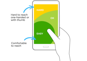
According to Nielsen Norman Group, most users hold phones one-handed, navigating with thumbs. The bottom portion of screens is easiest to reach. Top corners require hand repositioning. Place primary navigation within comfortable thumb reach—typically the lower half of screens.
Make Tap Targets Large
Minimum tap targets should be 44×44 pixels—preferably larger. Small links frustrate users and cause mis-taps. Space targets apart so tapping one doesn’t accidentally hit another. Generosity with touch targets improves accuracy and reduces frustration.
Simplify Menu Structure
Deep menu hierarchies work poorly on mobile. Reduce levels. Combine related items. Eliminate rarely-used options. Every additional tap to reach destinations loses visitors. Flat navigation structures serve mobile users better than complex hierarchies.
Consider Bottom Navigation
Bottom navigation bars place core actions within natural thumb reach. Apps popularized this pattern; websites increasingly adopt it. For sites with few primary sections, bottom navigation can work better than hamburger menus hidden in corners.
Make Hamburger Menus Work
If using hamburger menus, make them discoverable. Add text labels alongside icons. Ensure menus open smoothly and close easily. Make the menu itself touch-friendly with large options and clear hierarchy. Hidden navigation should be worth finding.
Show Current Location
Mobile users get lost easily. Indicate current page clearly within navigation. Use visual highlighting, breadcrumbs, or section headers. Orientation reduces confusion and helps users understand where they are and where they can go.

Enable Easy Return
Users must always be able to get home or back. Persistent home links, visible back buttons, and clear logo-as-home patterns provide escape routes. Never trap users in sections with no clear way out.
Test on Actual Devices
Emulators miss real-world problems. Test on actual phones of various sizes. Watch real users navigate. Hold the device yourself and try reaching all targets. Physical testing reveals issues simulations hide.
Prioritize Core Actions
Mobile screens have limited space. Not everything deserves primary visibility. Identify the most important actions and make them prominent. Secondary options can live in menus. Prioritization improves focus and reduces decision fatigue.
Navigate Mobile-First
Effective mobile navigation respects how people actually use phones. Large targets, thumb-friendly placement, simplified structures, and clear orientation make navigation usable rather than frustrating. Design for the majority—your mobile visitors.
Need better mobile navigation? At Proton Tech Lab, we design for real mobile users. Contact us today to discuss your website. Let’s make navigation work!